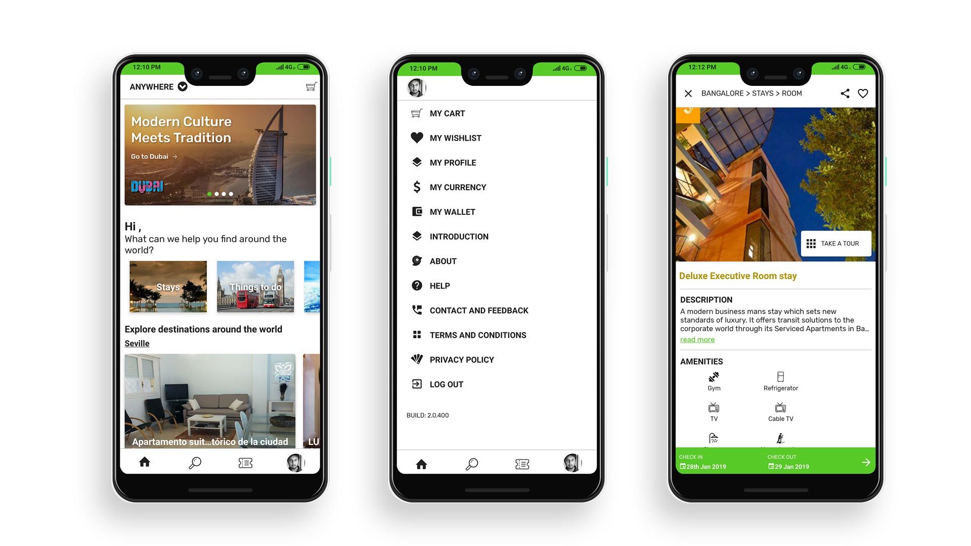
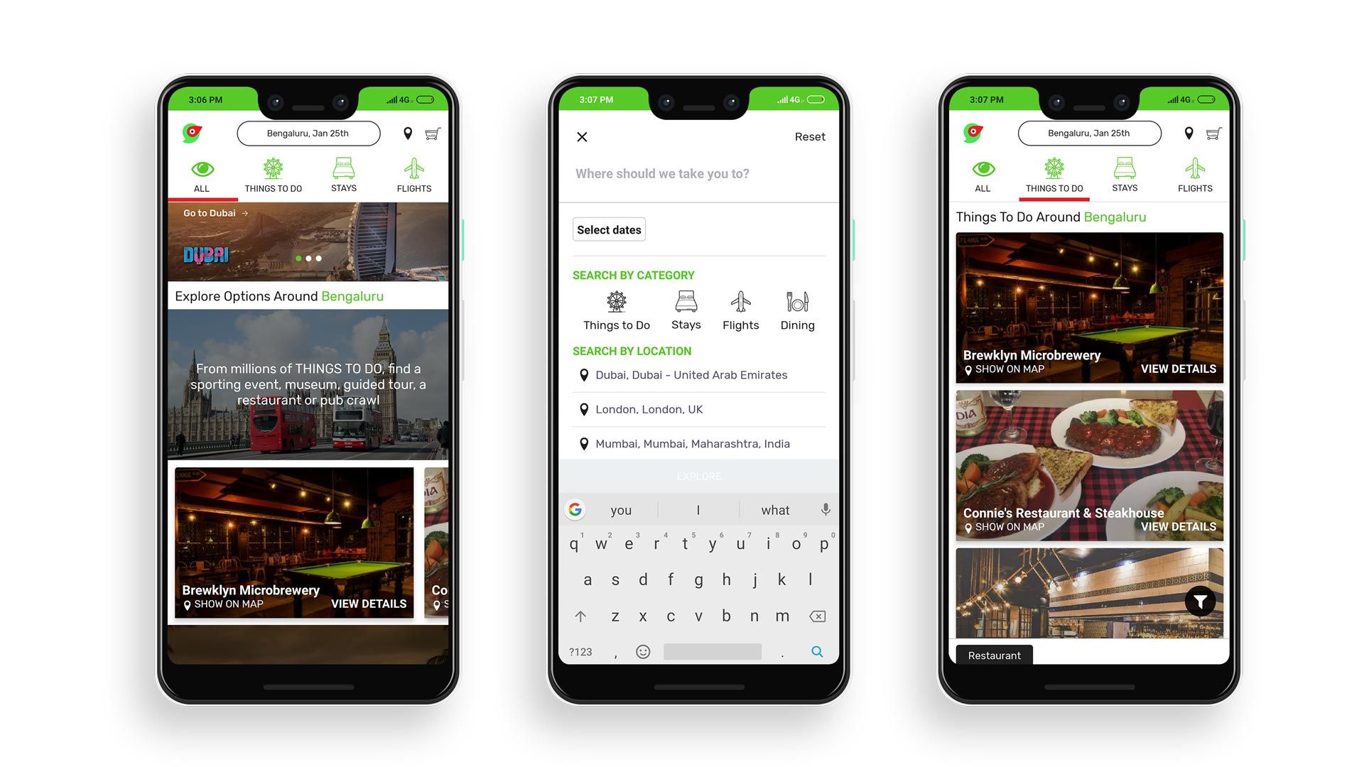
Stayology: Making the global hyper local
We designed Stayology as an app which makes the Global hyper-local and instantly accessible.
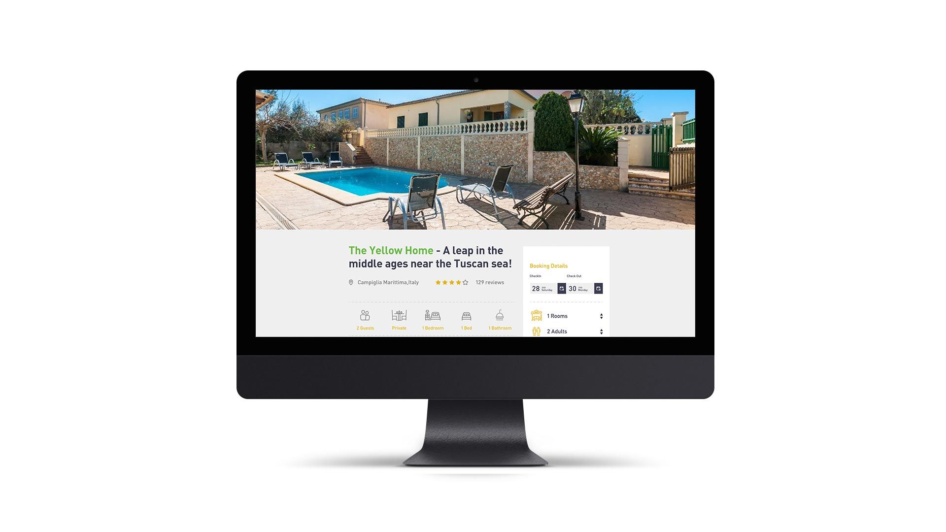
The aim was to make Global/Local travel, stay, experiences and events accessible and payable in a supermarket/shopping cart kind of environment. Hence designing Stayology as the supermarket for Local/Global travel and tourism.
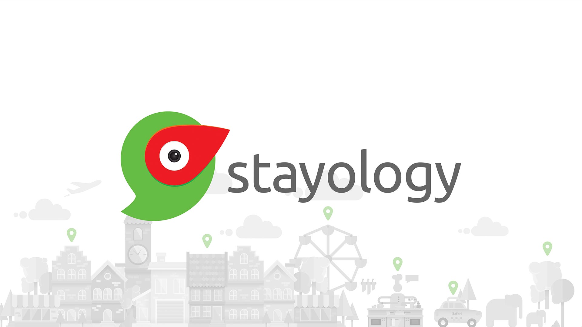
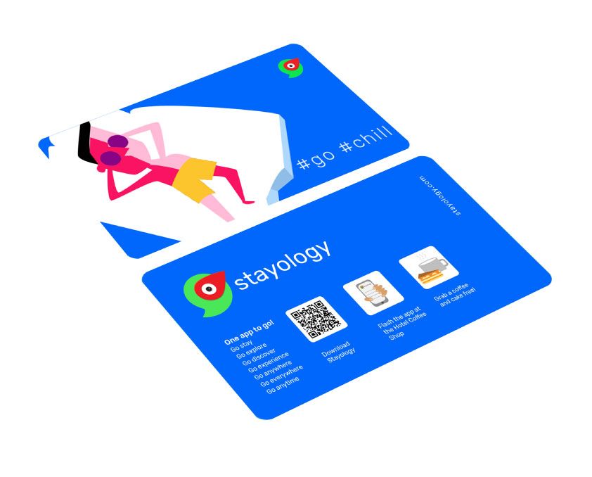
The Stayology identity is the combination of a pin (location) and a chat icon. It represents a dynamic conversation between people or places, where the global traveler gets to experience the local.
At a glance, the logo also represents a talking green parrot, with the pin making up its red beak. This further emphasizes how interactions enhance experiences. The color palette is a mix of a fresh green and a rich red, perfectly complementing the philosophy of brand Stayology. Iconic, Distinct, Clear.